Posts tagged ‘Design Focus’
Extras, Extras From IMM Cologne
The show team at IMM Cologne just announced a great tour that will introduce English-speaking visitors to some of the off-site “mini design centers” that have sprung up around the city in recent years. The tour is arranged so that in a half-day, you’ll get to see three of the locations, multiple showrooms at each, have lunch and still end up across the street from the main show by mid-afternoon, leaving you plenty of time to explore the vast halls of IMM Cologne for even more design goodies!
The stops on the tour include: Rheinauhafen, Spicherhoefe and ending up at Design Post which is a year-round showroom destination right next to IMM. Some of the many showrooms you’ll be able to visit on this tour include: Boffi, B&B Italia, Moroso, Kvadrat, Nya Nordiska and many others.
For more information on the tour, contact the U.S. office of IMM Cologne.
Hope to see you there!
What Makes “Couture” Couture?
The Paris couture shows for Winter 2010 are taking place right now, inspiring oooohs and aaahs of envy and inspiration for both Deb and myself. But as Deb often mentions, the descriptive phrase “couture” is too often tossed off to describe something without have a true understanding of what separates couture from something well-built, well-made, well-crafted.
Take a look at this video, where a Karl Lagerfeld sketch is transformed into a finished Chanel dress and jacket. Each pattern is made and cut by hand, each sequin hand-sewn, each seam hand-pinned…
Lagerfeld is known for his dedication to the petites mains, the specialty seamstresses, milliners, button-makers and other decorative artisans whose elaborate handiwork transforms a design into a showpiece, this video is a clear example of why they deserve his high praise.
Design Focus: Caroline Musgrove
One of the new talents that Susan and I met at imm Cologne d3 Talents was Caroline Musgrove a successful British Knitwear Designer who is expanding into bespoke knitted and embroidered textiles for the home.

Her work is inspired by traditional designs and techniques which she teams with contemporary materials. She softens the hard edges of Perspex( Plexiglass) with delicate hand surface decoration. Each hand knitted and embroidered piece is individual and unique from screens, panels, lights to curtains, cushions and scarves.

Knitted curtain inspired by damask patterns
We had a chance to chat with Caroline about her introductions, inspirations and what’s she’s working on next at her stand in Design Talents.
6
Favorite Fabrics From IMM Cologne
IMM Cologne is not much of fabric show, but what I did find there was absolutely stunning. Création Baumann, the highly regarded Swiss textile company, introduced several amazing new products, utilizing innovative print techniques and the latest in fiber and fabric technology. Here are just a few of my favorites.
SuperHero Fabrics Silver and Steel are two collections developed primarily for the contract sector, but I would love to use them in my own enormous windows. Silver features a thin aluminum backing in fabrics that range from opaque to sheer. Steel uses vacuum cathodic evaporation to adhere micro particles of steel to fabrics. The advantage of these new technologies is that the fabrics are washable and that the coating can be applied to a much larger range of fabrics and is less subject to the creasing of the metallic film.
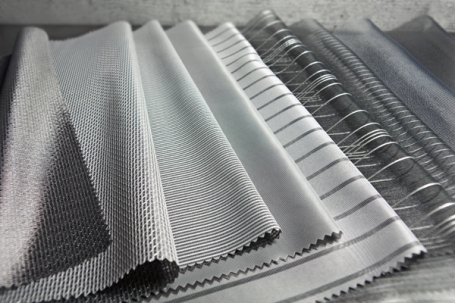
Creation Baumann Silver & Steel fabrics
Print Masters Providing an almost trompe l’oeil effect, Eplis features narrow ribbons of color transfer printed on a pleated fabric. It’s a fascinating combination of techniques that draws you in to explore it better. Another collection that merited a second look was a small group of digital prints on sheers that could be either cheesily retro or amazingly au courant depending on what section you looked at, as each of prints had detailed photorealistic sections intermixed with areas of blurring, overlay or other distortions.

Creation Baumann: Eplis & Garden
Seductive Layers Incredibly adaptable, the sophisticated Coco would look stunning in a loft environment or a traditional setting. The open star motif applies antique lace-making techniques in a thoroughly modern manner; a tulle flourish at the bottom is just another reason to love this fabric. Indiva is a two-layered sheer that shifts slightly during the printing process, resulting in a unique, slightly blurred effect that gives the look of fabric swaying in the breeze, even when it’s still.
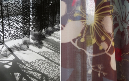
Creation Baumann: Coco & Indiva
Shrunken [Trail] Blazers Using a special paint that affects the shrink rate of the fabric and produces a crisp, dry hand, Création Baumann experimented with a tremendous range of looks. Violetta features layered blooms for a technical/traditional mix, a similar motif to that used on Coco; while Filippa also applies a burnout for additional dimensional and light layering effects.
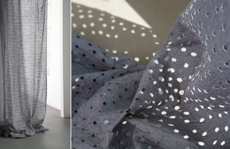
Creation Baumann: Violetta & Filippa
Crushed Fashion inspired and truly stunning in person, Saphir Crash is a sheer crush pleated offering while Yves is the opaque version, a blend of silk and metal.

Creation Baumann: Saphir Crash & Yves
David Rockwell’s Oscar Set

Several months ago when I interviewed David Rockwell he had just found out he had been chosen by producers Laurence Mark and Bill Condon to design the sets for this year’s Oscar telecast. He couldn’t reveal any details; so I had to tune in last night to see what he had done. I was not disappointed. Rockwell is no novice to set design, the acclaimed designer has done sets for Hairspray, Dirty Rotten Scoundrels and Rocky Horror Picture Show. The first architect to design the sets, he took his inspiration from Busby Berkeley movies and Berkeley’s legendary kaleidoscopic patterns as well as the Piazza del Campidoglio (The curved floral pattern on the stage was a direct reference. ) Thanks to Linda from Surroundings for the correction!


Wanting the event to be more party than formal gathering, Rockwell used state of the art technology to create tensions and energy between the audience and the performers. “We created a spatial and architectural solution for the 2009 Oscars that is based on storytelling, spectacle, and community,” explained David Rockwell. “We wanted to use a surprising and dramatic integration of technology and movement to celebrate the awards ceremony, which has become one of the greatest shared rituals of our time.” There were five LED screens that transformed and reconfigured, as well as 20 other still LED screens. An elaborate bandstand was placed onstage with a full orchestra that had the capability to move up and down the stage, and then break apart and disappear throughout the night.
The piece de resistance was the new proscenium curtain Rockwell created of approximately 100,000 Swarovski crystals in a variety of shapes and sizes, The crystal curtain stands an awe inspiring 60 feet tall and 100 feet wide and weighing in at three tons and being comprised of over 6,000 one-meter hand crafted strands. 
IMM Cologne Design Talents
There may have been a slightly tentative mood to IMM Cologne during the first day, with exhibitors and attendees both testing each other’s commitment, but soon enough everyone settled into their roles and while it wasn’t quite business as usual, it was close. At the show’s end, most expressed the type of surprised satisfaction that things hadn’t been as bad as they’d expected.
That isn’t meant to be flip, because expectations have an incredible impact on the success of a show. In other year’s the slight drop in overall attendance, the decline in international visitors, past exhibitors who didn’t show and the more limited range of new product introductions might have all been cause for significant grumbling and an aura of discontent, but because no one is really sure what to expect in business these days, the relative normality of show business was greeted as success. New products were shown, orders were placed, deals were made…the design industry continues to do business. And IMM Cologne demonstrated that even in this uncertain era, shows remain a critical, vital, part of the design business.
So, that said, let’s get to the good stuff! Here’s a few favorites from the show. For more on what caught my attention at IMM Cologne, check out my postings on Designer Pages, Surroundings and in the March issue of Vision magazine.
I have definite soft spot for young designers and the d3 design talents section of IMM Cologne typically offers a full buffet ideas and approaches—thoughtful, playful, analytical, experimental, etc.—sometimes all from one designer.
Chae Young Kim
Deftly combining natural and artificial, intuitive and scientific approaches, hand-drawn and digital renderings, Chae Young Kim developed a series of patterns until the theme Urban Camouflage. Using fractal structures and patterns to construct an almost unnaturally lovely take on nature, Kim uses computer graphics and repeats that deliver a truly hand-drawn feel.

Urban Camouflage by Chae Young Kim
Kai Linke
Ich war’s nicht (It wasn’t me) is a collection or purposely deformed stools, shapes that look as if they have been twisted and damaged through use or abuse, but were instead created that way. One of Linke’s earliest prototypes was made of a felt form that was then filled with concrete. The weight of the liquid concrete further distorted in shape and once the concrete hardened, the felt was stripped away and the final, randomized shape was left. In these examples the stool on the left in steel and bronze, the one on the left is concrete.

Ich war's nicht by Kai Linke
D.E.C.A.F.
A design collective, the D.E.C.A.F. name represents their concept of Design-Environment-Concept-Art-Furniture. The group created a lamp that brings “street art” into the home in a fun, functional, (relatively) clever manner. Designed to work for both interior and exterior applications, the Graffiti lamp, according to its creators, “sheds light on those who work in the dark.” I love the concept and the overall look, however I would have loved loved it had the graffiti said something other than “lamp”.
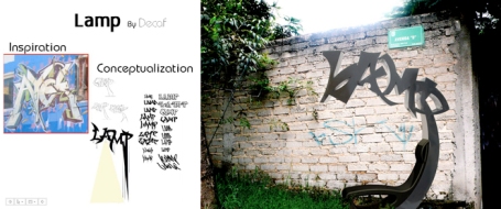
DECAF Graffiti Lamp
Raphaël Charles
The 20/30 rug appears to be made rocks or stones scattered on the ground. The name comes from a standard grade of coal and is actually composed of polyethylene foam leftovers that are typically not otherwise recycled. The main rug is made of springy nuggets attached to felt base and each is supplied with a scattering of loose “lumps” to use as the owner wishes.
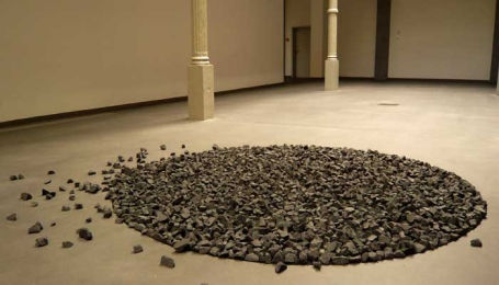
Raphaël Charles 20/30 rug
Ryohei Yoshiyuki
There were a couple of pieces of convertible furniture that I found particularly appealing in the d3 section. This piece is called Your Level, a typical modern cabinet that can be transformed into eight separate shelving storage units, or combined in a variety of manners. Even the tallest unit stands securely against the wall on its own (assuming of course you have relatively level floors) without the need for additional support.

Ryohei Yoshiyuki My Level
Philippe Malouin
This piece took second place in d3 innovation award. Called the Grace table, it is a remarkable innovation in engineering, although I have to admit, in looks it leaves something to be desired. Grace is an inflatable table, large enough to seat 10 adults and sturdy enough to support all the plates, cups, bottles and more that go with meal of that size. Malouin’s challenge, working with Eurocraft, a leading manufacturer of inflatable structures, was that stability, rigidity and flat surfaces are not the typical characteristics of inflatable furniture. And, when deflated, Grace, along with its legs and support structures all fits in a standard-sized duffle bag.

Philippe Malouin Grace table
Pepe Heykoop
Recent Eindhoven graduate Pepe Heykoop took home first prize the d3 innovation awards with A Restless Chairacter, a chair based on a rickety old chair in his studio. Through re-engineering each joint in aluminum and rubber, Heykoop is able to control the overall flexibility of the chair, which means the user can wiggle, twist, squirm and sway without damaging the structure of this seemingly stiff, uncomfortable chair. The flexible frame is wrapped in an equally flexible skin of polyurethane rubber.

Pepe Heykoop A Restless Chairacter
Heimtextil 2009/2010 Trends
Although the overall theme of the trends presented at the January 09 edition of Heimtextil was Expect the Unexpected, none of the individual trends really broke any new ground. The trend hall did however present a comprehensive, well-grounded look at the near future and, as one would expect for a textile show, there was a strong emphasis on innovative fabric constructions, fibers, techniques and finishes.
Here’s a quick look at each of the six main trends along with a sampling of shots from the trend hall. For greater detail on the Heimtextil 09 trends, along with the trends and new product finds from Frankfurt, IMM Cologne, Paris Maison&Objet and other shows, I’ll showing hundreds of images during my presentation on Thursday, May 14, at the Vision show in Atlanta.
Illusionist
New technologies allow for featherweight padding, layering and folding that create mass and volume without the weight and bulk. This volume can come from layer upon layer of breezy mille-feuilles; soft yet structured folds; or sculptural padding.

Illusionist: Heimtextil 2009/2010 Trend
Time Traveler
Open up a rare treasure chest where every second slipping by is cherished for the creation of a new cultural heritage. From medieval mystique, a rejuvenated Art Nouveau and Art Deco to centuries-old classics, the stage is set for ornamental opulence, laced luxuries and sensuous graphics.
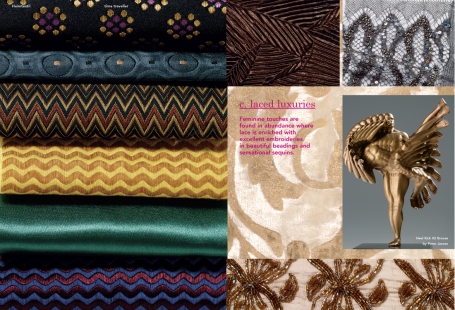
Time Traveller: Heimtextil 2009/2010 Trend
Fortune Teller
In a world where cultures collide and yesterday spills into tomorrow, inspiration comes from the vagabond, the bohemian and free spirits everywhere. Eco and ethnic folks break all the rules and create a rainbow of new ethics and traditions. Fame and fortune can be found in chaos and eccentricity.

Fortune Teller: Heimtextil 2009/2010 Trend
Alchemist
Dissecting the structures of metals and minerals, alchemists recalculate the laws of nature. Catching the light from every angle, facet and curve, sharp shimmers and sheens add new dimensions to an intriguingly sculptured surreality.

Alchemist: Heimtextil 2009/2010 Trend
Witchcraft
Bewitched and bewildered by the mythic creatures of the forest, artisans copy real and imaginary fur, feathers, floral and fauna. Vintage skins and technology that allows fabrics and finishes to mimic nature are key looks; while loose, floating yarns add to the modern rustic mood.

Witchcraft: Heimtextil 2009/2010 Trend
Enchanted
The artist’s sketchbook of pop fantasies has been torn up and stuck together again. A playmania of bold and brash color explosions, free-painting a wacky world with a sprinkle of anar-chic to smooth over the crazy edges.
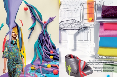
Enchanted: Heimtextil 2009/2010 Trend
Which is your favorite trend? Take our poll and find out where you’re favorite ranks!
Folklore and Fantasy
I’ve always loved fairy tales and was fortunate enough to have discovered the wonderfully strange and surprising adult world of the true Brothers Grimm while still fairly young, thanks to a collection of books passed down from my great-grandmother. Those stories lead me in turn to Greek, Roman, Norse and Irish myths and mangled pronunciations aside, I could still tell you many of those stories today.
But I had never before heard of the Kalevala, the ancient Finnish origin story cycle until I read about Marimekko’s Spring 2009 introductions. While there is awhole wonderful collection of new fabrics, my favorites are those by Sanna Annukka, who was inspired by the interlocking stories of Väinämöminen, the shamanistic hero of the Kalevala, whose adventures (and misadventures) gave shape to both the Finnish landscape and its peoples character.

Kanteleen kutsu
Kanteleen kutsu (Call of the kantele) show the enchanted forest animals who have gathered to hear Väinämöminen play music on the kantele, the instrument he created from the jawbone of a giant pike. In addition to the fabric, Marimekko has developed an entire series of products—mugs, tea towels, potholders, etc.—featuring many of the individual animals from Kanteleen kutsu.
Even Väinämöminen himself was so moved by the music he played on his new instrument that he cried Onnen helmet (Pearls of happiness) giant tears that flowed into the sea and changed into precious gems.
Several of the stories focus on various character’s interactions with the Taikamylly (Magic mill), which, instead of churning out grain, produces tools, coins, jewels, and more.
Kaleva is the Land of Heroes and Ihmemaa (Wonderland) illustrates that magical realm including Lake Alue where, hidden in the depths, a whitefish has swallowed fire fallen from the skies above.

Onnen helmet (Pearls of happiness), Taikamylly (Magic mill) and Ihmemaa (Wonderland)
You can see more Marimekko’s Spring 2009 collection here.
IMM Cologne 2009 Trend Preview
In September I was fortunate enough to see the unveiling of IMM Cologne’s 2009 trends at a special presentation in Barcelona. Four of the five trend board members were present and provided a very interesting take on the entire trend development process.
The 2009 trend board consists of Eero Koivisto, a Stockholm-based architect with Claesson Koivisto Rune, and a veteran of the process, having participated in three previous trend panels. The other returnee was American designer Stephen Burks, founder of Readymade Projects. Both Stephen and Eero were much more comfortable speaking about “trends” than either first-time panelists Arik Levy and Giulio Ridolfo. The final member of the 2009 trend team was British design journalist Markus Fairs, who was unable to make the live preview but was on record as being “suspicious of the notion of trends.”
This wariness concerning “trend” was also expressed by Ridolfo and most particularly by Levy. “My worst nightmare is that some designer somewhere takes what we’ve organized here and uses it literally,” said Levy, “developing a product based on exactly these materials and these colors because that’s what is ‘on trend’.
Levy went on to say that the actual process and development was very intense, collaborative, and at times, contentious. Burks agreed but noted, “It’s interesting, having finished up our part of the process months ago, to see the result in print and recognize how certain ideas have become more evident and noticeable just in that time.”
As the longest serving trend board member Koivisto emphasized that approach of the board was very “pluralistic. What we attempt to do is show no one perspective or point of view, but many points of view. The goal of these trends is not to dictate, but to provide a context.” And he continued: ‘I can say, having been involved now for four years, that these trends have proven to be accurate…that looks, materials and concepts we discussed in previous years have become factors in the design market.”
From the discussion among the board members and when responding to audience questions at the presentation, the core of these trends seems to be the simultaneous urge to experiment contrasted with the desire to preserve the best of the past.
So, here are quick summaries of the 2009 themes:
Extra Much
The design expression of extreme ideas as opposed to minimalism, not just in terms of embellishments and detailing, but on how technology influences both the design process and the possible end results.

Extra Much IMM 2009
The color palette for Extra Much is built around a vibrant peacock blue/green. A sunny yellow and orange add punch, while softer tones of cream, apricot and pale cocoa add depth and richness while a deep and a slightly paler purple bring a note of complexity.
New materials from other industries are adapted for home product use, while familiar materials like aluminum and Plexiglas are re-examined in the light of innovative new processing techniques.
Near and Far
A contemporary approach to design that values both the industrial and the artisanal, while always trying to stay clear of any “colonial attitude”, an attempt to balance both micro- and macro-production.

Near and Far IMM Cologne 2009
The color palette for Near and Far is very muted: A collection of warm and cool greys, with just the barest hint of pink, green and blue to lighten things up.
Seagrass, bamboo, felt and other natural materials are key, while synthetics are woven or shaped into natural-seeming structures–honeycombs, knits and more
Teepee Culture
The name for this trend created quite a bit of confusion for the mostly non-U.S. audience in Barcelona, with the board fielding several questions about Indian tribes, native American spirituality, etc. The title could have just as easily been Tent Culture, but that just doesn’t sound as nice! The core idea here is about paring down to the themes, values and experiences that matter; removing the clutter of over-design to focus on life.

Teepee Culture IMM Cologne 2009
For a natural/neutral theme, the color palette for Teepee Culture is rich and robust, based around a warm red. Khaki, army green, a true purple and a soft greyed blue round out the palette.
The main material for Teepee Culture is paper—shredded, recycled and in any other way processed, it represents the responsible re-use of resources.
Re-Run Time
This theme takes a bit of Teepee Culture, some aspects of Neat and Far and even something from Extra Much, but then combines it all for a different outlook. Re-Run Time is a rather Zen approach to design—contemplative, wanting to fully understand both the individual component and its role in the wider world.
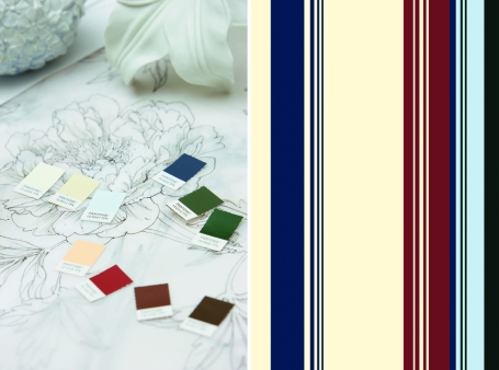
Re-Run Time IMM Cologne 2009
The main color is a classic, neutral beige supplemented by a two deep burgundies—one a bit warm and one a bit cool—along with a blackened green and very dark navy. A shell-pink, winter white and silvery-grey add a touch of lightness.
The materials for Re-Run Time are rich in memory and inherent detail such as leather, suede and horsehair, silks & woolens, waxed woods and variegated stones.
Squint!
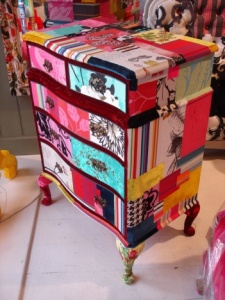
All of this is just a roundabout explanation for how and why I picked this week’s design focus subject. Squint, a favorite of Deb and mine’s since we first discovered it three years ago, is a custom upholstery and design firm based in London. Launched in 2005 by artist Lisa Whatmough, who was originally looking for a way to put to use her collection of antique and vintage textiles, she burst onto the scene with brilliant patchwork upholstery on classic furniture pieces.
She soon added lighting and accessories and as demand for her pieces grew, she had to abandon the vintage pieces/vintage fabric combinations, although those types of items are available by special order. She now designs her own patterns and furniture blanks, although a custom mix-and-match option is available. Take a closer look at Squint!
Gives the term “patchwork” a whole new meaning, doesn’t it?


